If you have talked to me at all about my work in the last 3 months, it’s safe to say I’ve brought up TextQL to you — I continue to be amazed at its capabilities and what it can do for data integration, analysis...and now visualization. As a Tableau developer and data viz enthusiast I was super intrigued this week when TextQL announced the launch of interactive dashboards in their platform. I had been exploring TextQL's capabilities recently, but with this announcement I just had to get back into the tool and see what Ana could do. Come along with me as we explore some data and 'build' a dashboard in TextQL.
Tell Me About My Data
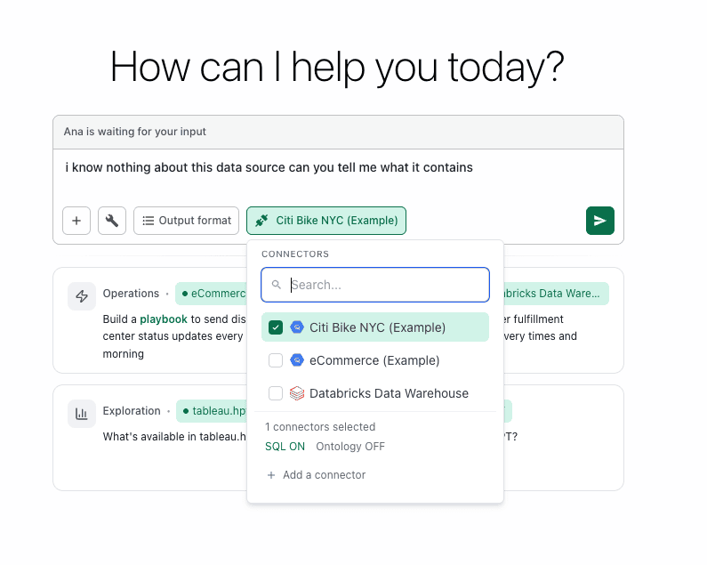
I started out pretty simple. I wanted to explore the sample data set TextQL provides: Citi Bike NYC data.
Since I had never worked with this data set before, I asked Ana (TextQL’s analytics agent) to tell me about the data set.
She ran 8 tools and came back with a summary:
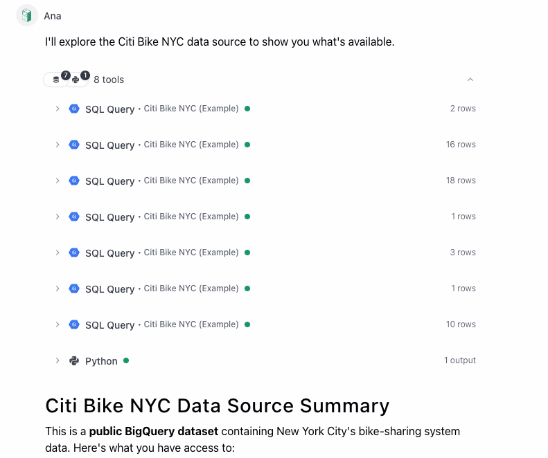
What I love about Ana is that she shows her work, so I can click into any of these steps and see what she was up to. After 7 SQL queries to explore the data, she ran Python to create the output for the summary.
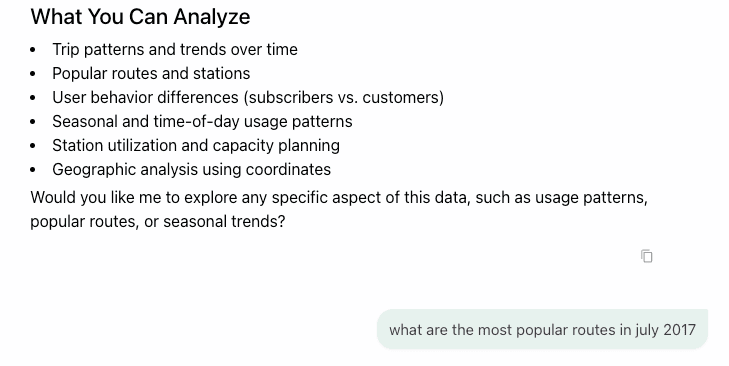
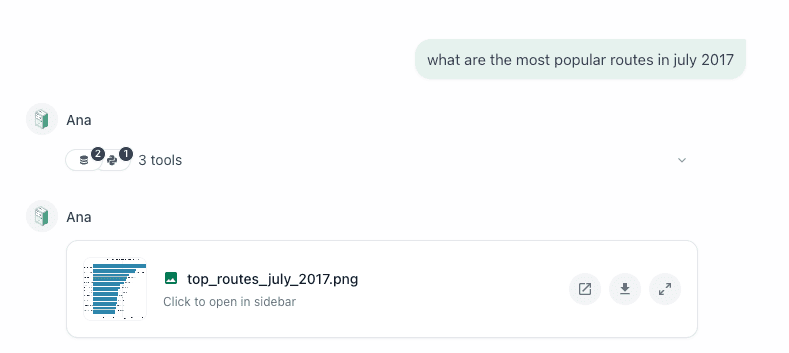
As part of the summary she included a “What You Can Analyze” list at the end. I took her suggestion and asked to see the most popular routes in July 2017 (she had informed me that the data was available for July 2013 to May 2018).
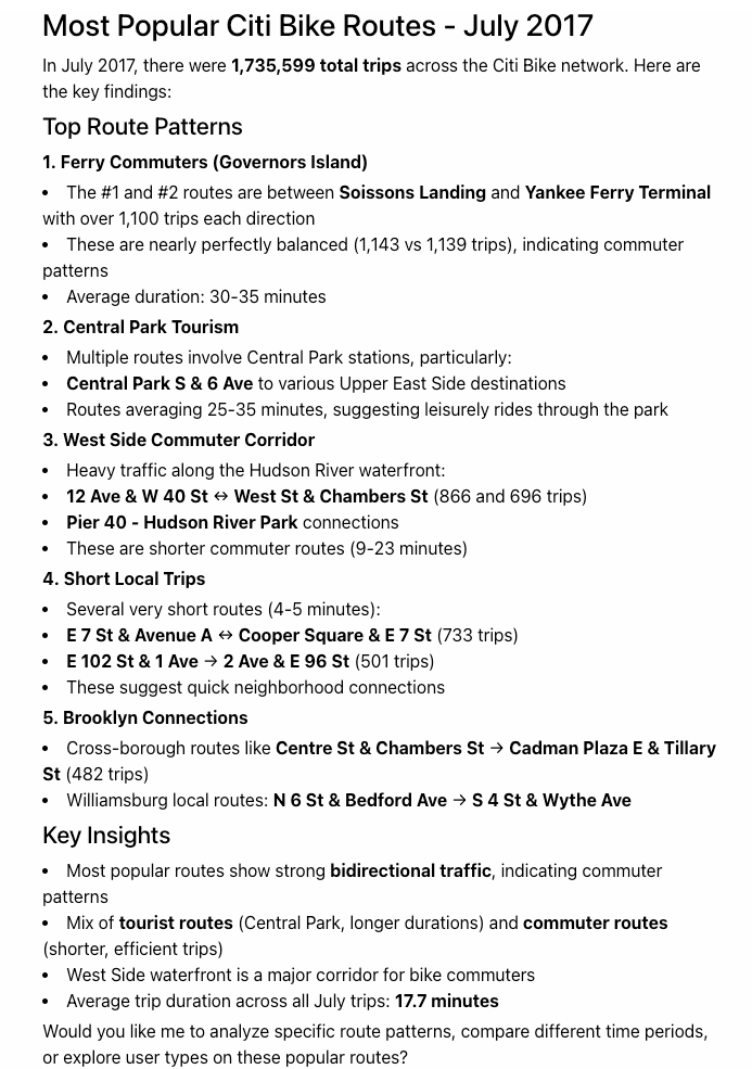
Now, in my past life as a business analyst, if someone had asked me this question, I would grab the data, throw it into a bar chart, and rank by number of trips, which is exactly what Ana did — and she did it quickly. Hooray!
But then, this is where Ana really excels. In addition to the bar chart .png she provided, she also provided a summary of the results in natural language text and included some key insights about potential reasons WHY these particular routes were so popular, including commuter patterns, proximity to subway stations, and leisure rides in Central Park.
In the same amount of time it would have taken me to just build the chart, Ana provided the chart to answer my question and then got to the next level of the analysis — something that would have taken me, a non-New Yorker, many minutes to read, process, research, and integrate.
Now, within a few minutes, I can speak intelligently about a data source that just previously I knew nothing about. And I can begin to think more analytically about the data at hand. What other angles can I explore for what this data means? What actions / decisions can I make from it?
Exploring Further
I decide that I want to know more about how weather impacts the usage of the bikes. My hypothesis is that there is a strong correlation between good weather and high bike usage, but I want to see the data to prove I am right. ;)
Now, I don’t have any weather data myself. I don’t even know where to go get this data. And as far as I know, Ana doesn’t have this information in her available connectors set up in my environment. But I figure I’ll ask her anyways to see how she responds to inform me that she doesn't have the data...
At first she tries to run a SQL Query against the Citi Bike data connector I included in my Thread. But that doesn’t return anything weather related. At this point, I expect her to say “No go - I don’t have the data in this Thread.” But she surprises me and goes straight to an open source free weather API! How cool is that?
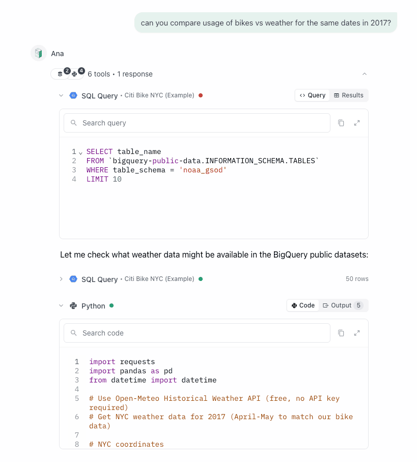
She pulls down the data for a subset of the Citi bike data and merges the two together.
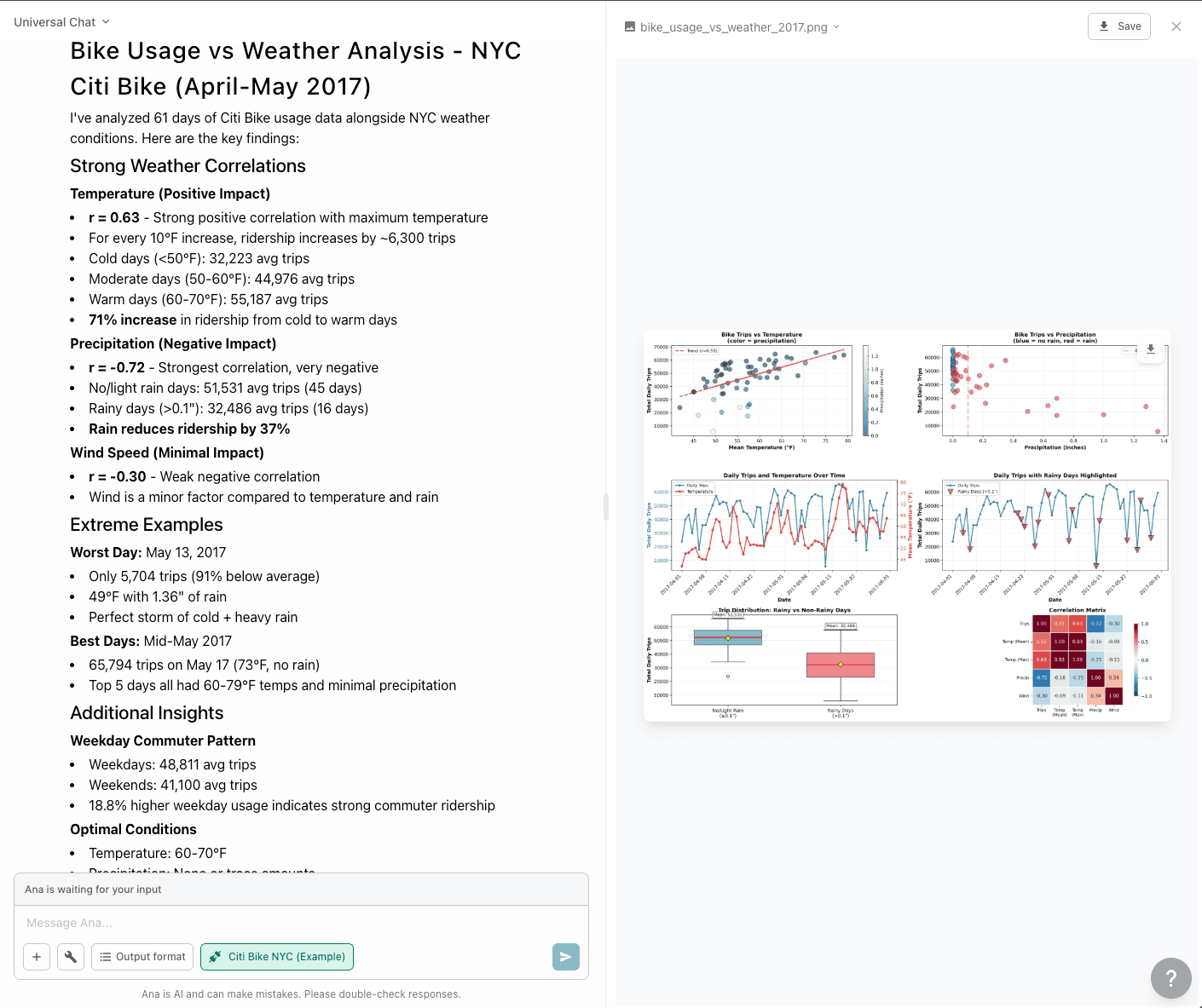
And voila! In a matter of minutes, Ana has:
- Reviewed the data she already has
- Gone to find the additional data I requested that wasn’t included
- Found a free data source she could use and brought in the data
- Merged it with my existing data
- Analyzed it and returned the results with a detailed statistical analysis
Now, while the visualizations in this example are not interactive or the prettiest, they are pretty damn good for an output with less than ~15 minutes of work. They give me the information I wanted, plus more. And they open up other avenues for me to keep exploring and drilling into my data. (And let’s face it, Stats was never my jam in school so having Ana do the heavy lifting for me is a relief.)
I can now say my hypothesis was correct: better weather = more bike rides!
Level Up
As I mentioned before, just this week, TextQL released Dashboards. So of course, I had to jump back in and see how Ana would handle my previous analysis with the Dashboard capability.
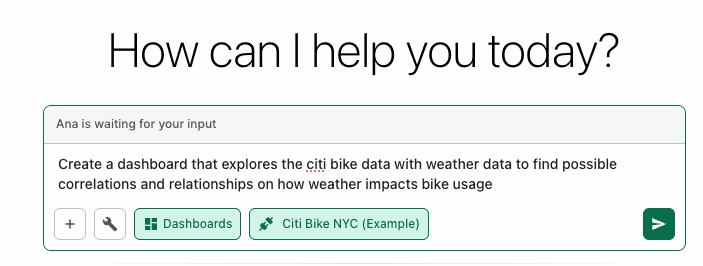
In the Dashboard window in TextQL, I select “+ New Dashboard” which opens up a Thread with Ana with the Dashboards output tool selected. I give her a pretty vague prompt because I want to see what she can do.
About a minute and thirty seconds in, Ana lets me know to hang tight.
And one minute later I get my results....
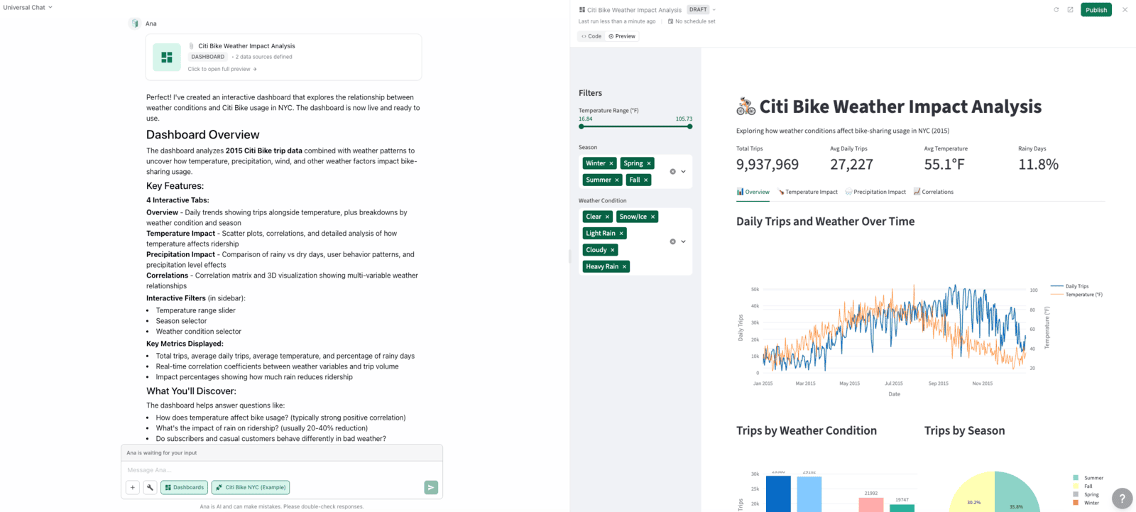
I now have an interactive, multi-tabbed dashboard exploring the impact weather has on the Citi Bike rentals in 2015 (Ana must have chosen that time range for me.)
From a Tableau developer’s perspective, these visualizations are pretty good. I certainly prefer them over the static images that Ana provided in the .png in my previous Thread. The colors are fine and (possibly?) color blind friendly. I like the use of icons in the Tab names. And the dashboard elements easily scale as I resize my window. There are some spacing things that need slight adjusting, but it has a good use of white space and text hierarchy. The filtering is decent but needs some tweaking, though I mostly like the experience.
- Change Seasons to Months for the time filter
- Remove Temp filter
- Add in Neighborhoods
- Add in “Select All” options on Filters for easy UX
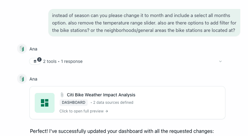
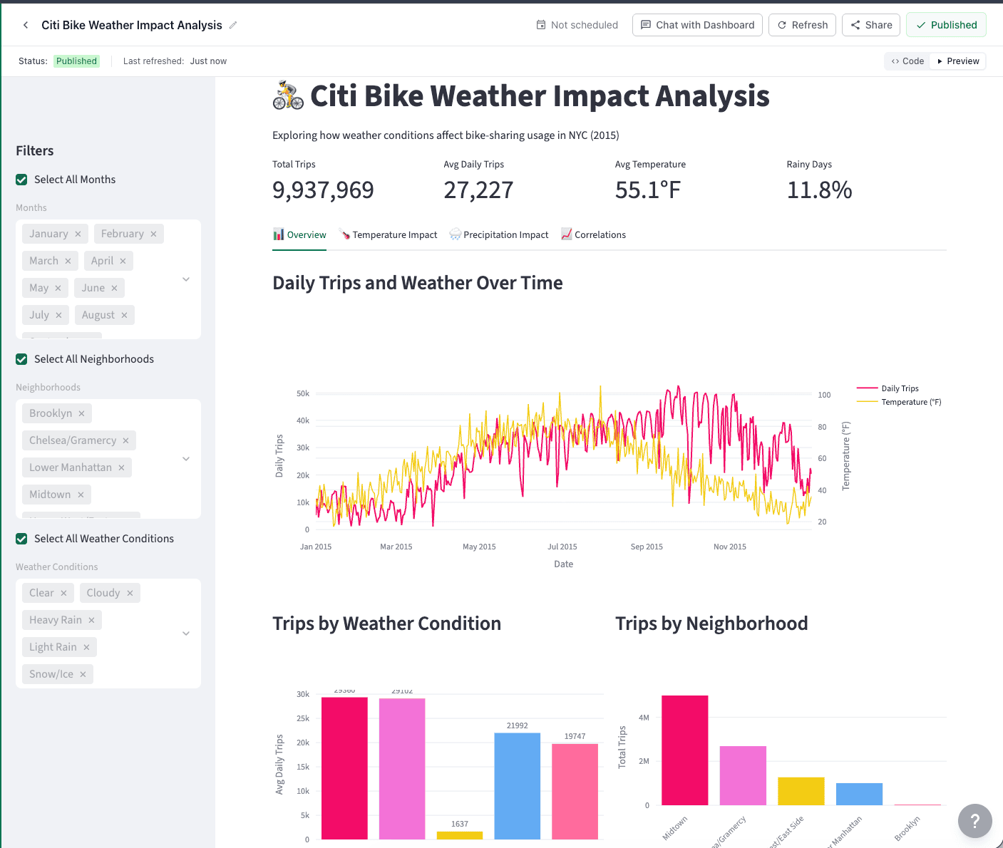
Here is the updated dashboard - peek the new filters on the left pane:
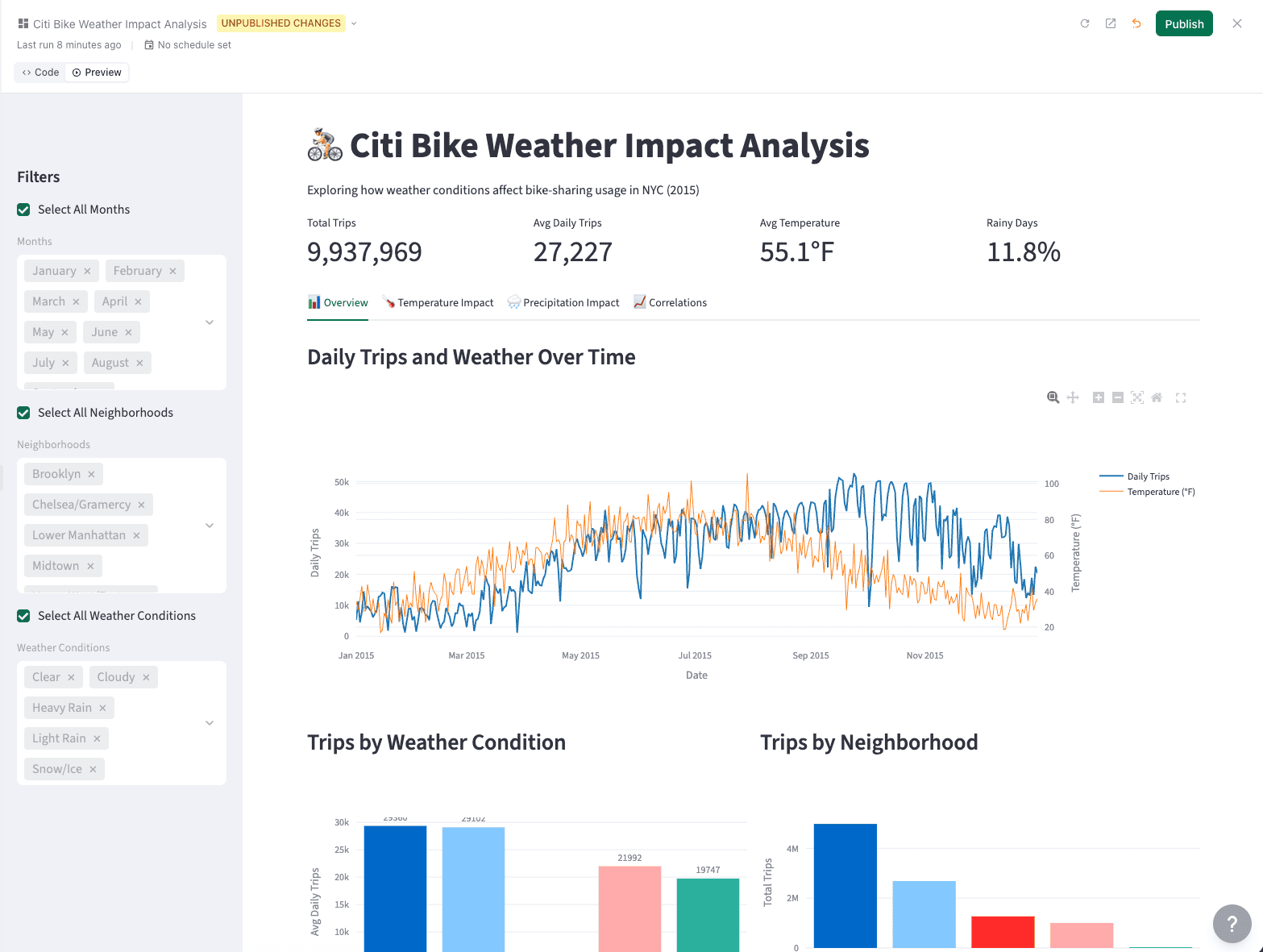
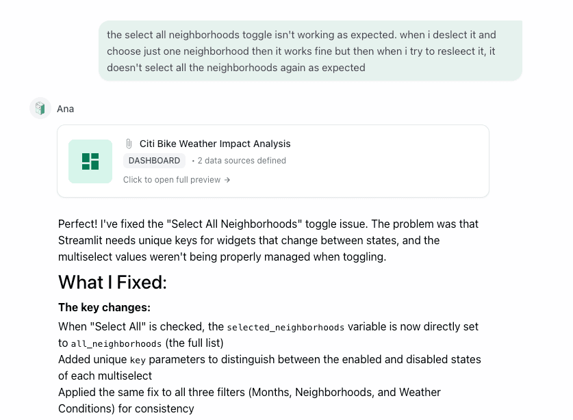
Things are looking good at first glance, though upon interaction with my new filters I find some bugs in how the Select All options work. I give Ana that feedback (luckily she doesn’t mind some typos!).
Okay now we are getting somewhere exciting! Everything is looking really good. I want to see what happens when I ask Ana to change the colors to match a random swatch I found online, took a screenshot of, and pasted into my chat with Ana asking her to update the colors to match the swatch.

Alright - she’s got the dashboard updated. Surprisingly, that one seemed to take longer than some of the other requests.
I love it!
From here, I can publish the dashboard to users in my organization and let them see and interact with it. I’d say that was an hour well spent to not only explore the data, create a dashboard, AND write this blog post!